

Defining The Problem
When people want to go to the tennis courts they don’t know if they’re occupied or not. It’s a gamble and then a waiting game. Players are unable to leave, otherwise someone else might take the next available court. DropShot is an application aimed to redesign the planning experience of reserving a tennis court.
Secondary Research
Consumers are willing to wait longer with pessimistic wait times if they can enjoy other things while they wait.
In a 2009 study to improve their public tennis courts, the City of Oswego found that recreational tennis players will travel a maximum of 15 mins to play.
Typical time for a tennis match is 1.5 - 3 hours.
Facilities are planned based on number of players within six miles or a 15-20 minute drive-time from the site.
The USTA suggests the market should support one court for every 10,000 people.
To understand the space we were working in, we gathered data on tennis playing habits and what the current execution of USTA standards were. Since the pandemic there was a 22% increase in tennis participation (a great social distancing activity). This resulted in low court access hindering the sport’s retention.
User Interview

We conducted user interviews to allow us to identify patterns of tennis players’ routines, calculate how long barriers cost our players, and pin point factors that eliminated wait time. The data from user interviews gave us insight that players plan their day by preparing ahead of time, their level of tolerance for complications, and how much play time they can get out of their activity.
Personas
Our research categorized players into two groups of leisure: casual and serious players. Using our personas, we clarified the scope of the project was to help reduce frustration by eliminating uncertainties and giving our users realistic expectations. To solve our users needs, our application needs to:
Find a tennis court
Reserve a tennis court
Arrange plans with a friend


User Flow
To outline the necessary functionality, we utilized user flows to represent how our users will navigate the app.

Flow #1: Book a tennis court
Flow #2: Arrange plans with a friend

Sketching

The next part was to create sketches from our critical user flows. Our early ideation included a map near user's locations for their convenience. The second page is for user to efficiently plan and book a court by eliminating uncertainties. On the third page, we incorporated a messaging feature for users to connect with a tennis partner and set up matches.
Before moving on, we wanted to do a guerrilla usability test to get early feedback on our designs. We wanted to make sure it was intuitive to our users and that our designs were consistent throughout the app. Our testing gave us confidence that our users understood the purpose of the app. The main finding was to clean up our UI elements so they are understandable and prominent.
Low-Fidelity Wireframes
Based on my research and feedback, I was able to create low-fi wireframes to provide a visual understanding of this application. Keeping in mind that this is suppose to be a quick and easy app to use, our intent is to keep the amount of pages to a minimum to optimize conversion and to make sure we can reduce the amount of cognitive overload.

Design System

We chose a color palette that are familiar to tennis lovers. Blues and greens provides feelings of trust, reliability, and revitalization. We chose a simple and readable typeface that would be easy to read at any size or boldness. Simple and clean icons were used throughout the app to quickly give information or help users identify actions.

Accessibility Check
To make sure our design is inclusive, we performed an accessibility audit to guarantee that users with limited visual abilities are able to enjoy our app. Color combinations of our palette were tested to ensure legibility. Each frame has passed WACG AA standards.
Usability Testing
This usability test revolved around if our users could reserve a tennis court successfully. Our goals were to justify the steps used to book a tennis court. We wanted to see if it felt natural for users or if there were details that would make them hesitate. Our goal was for users to understand the flow of the app to avoid the risk of a large learning curve. After identifying our critical usability issues, we were able to iterate our prototypes.

Critical Usability Testing #1
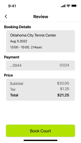
Users needed responsive design to indicate that they have selected an action. We implemented this by enlarging and highlighting an icon once a court is selected. In addition, a review page was added right before confirming booking so users can double check their details.


Critical Usability Testing #2
To resolve our second critical issue, we provided filters for the home page/map so that users have the same options no matter what route they take.


Critical Usability Testing #3
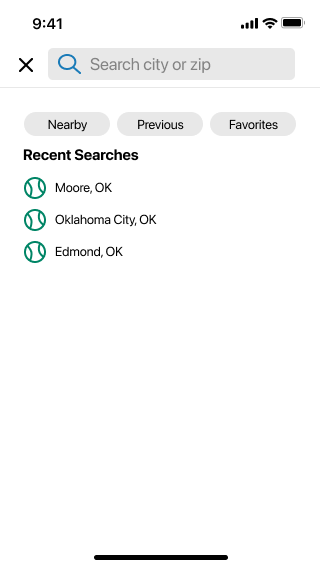
Our third critical usability issue, was that our users wanted freedom to explore. “What if I want to see tennis courts where my friend is?" A large search bar was implemented so that they're able to navigate wherever they were. A location arrow was also added to reorient users’ current location.

High-Fidelity Prototype
After researching, ideating, and testing, we were finally able to finalize the DropShot app.
Booking


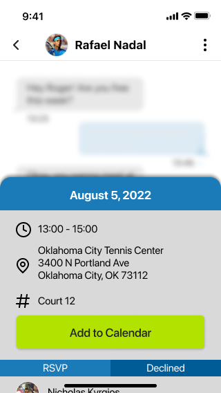
Messaging


Reflection
This project validated that early testing is going to give me the most effective results. I believe if I had done more testing in the beginning, I would have avoided having so many critical usability issues and eliminate time iterating. In the future, I would opt to create a more rigorous interview guide to gather more useful data. Overall, I believe my design would efficiently relieve the anxiety of wasting time waiting for a tennis court and encourage players to go out and play tennis.
