

Defining the Problem
Data shows that, on average, 20% of people who say they’re going end up attending events. Despite the efforts of event hosts for better engagement, the conversion is still low. Users may not be getting effective communication about the upcoming events or users need an incentive to attend.
Competitive Analysis
To understand the space we are working in, we took a look at industry leaders like Meetup, EventBrite, and Facebook, to see how they are trying to solve attendance conversion. All three apps allow users to curate their interests by letting users to favorite and share events, turn on notifications, or add them to their personal calendar. Meetup does a great job at keeping users focused on conversion by permitting users to RSVP where ever they are on the event page. There’s a variety of ways these apps have tackled their information architecture. This will be pertinent in finding relevant events. A disservice I have noticed is that going through a list of so many events can be overwhelming and might make users burnout. Compartmentalizing copy or adding simple UI can help reduce cognitive overload.
Incorporate events with notification reminders and allow users to add event reminder to their calendar.
Have a sticky footer to allow users RSVP to the event at any point they’re viewing the event details.
Pay attention to information architecture to allow users to easily discover new events.
Add map feature so users can arrive in person to the event.
User Interviews
We conducted user interviews to allow us to identify pain points and behaviors of people who use event apps. Our goal is to understand what factors can lead to user engagement and what affects user attendance.


The fear of the unknown or feeling unprepared can deter attendance.
Consistent engagement can support users and relieve anxiety.
People want to find where they fit in or belong before making a commitment.
User Flows
Focusing on encouraging our users to actually attend the event they have RSVP to, we decided to incorporate gamification and in-app messaging. We outlined two user flows to represent these ideas.

Flow #1: Checking-in event to receive badge
Flow #2: Message event attendees

Sketching

Guerilla Usability Testing
Before moving on to low-fidelity wireframing, we wanted to get early feedback on our designs. We hoped to validate that Third Space was easy to use. More importantly, we wanted to see if these designs would motivate users to participate in the events they have RSVP to. The first task was to check-in to the event to receive a badge, assuming they have already arrived at said event. The second task was to message people that they met at the event they attended.
Edit icons to be more understandable
Add push notification to remind and motivate users
Create incentive design to promote engagement
Low-Fidelity Wireframes


Design Systems
Our brand color yellow was used throughout the app as the main color for CTA buttons. We utilized the light blue to accent important information to get our user’s attention.
#FAC300
Cheerful
Optimism
Prestige
Compassion
#FAC300
Caring
Reliability
Calmness
Tranquility
#FAC300
Dark mode to emphasize the most important content and allow for better scrollability

Cabin is a san-serif typeface that was chosen for the distinction of capital “I”, lowercase “l”, and number “1”. Additionally, it was legible and mobile-friendly. To bring contrast, Oswald was paired for the perfect typeface combination.
Usability Testing

This usability test was to see if users felt motivated by our app features to continue attending events found on Third Space. We will test our hypothesis that gamification supports user engagement; and that users will feel more connected to people they just met or will meet through our messaging system.
Critical Usability Issue #1
There was an error in the prototype, the app still asks to check-in on the badges page even though they already did. We went and fixed the routes like removing the checked-in event from the home and badge screen to the next upcoming event.


Critical Usability Issue #2
It’s unclear who is talking in a chat room with multiple users when they don’t have their name with their photo. To help users, we added names in the messages and allowed users to click on their friend’s image to view their profile and information.


Critical Usability Issue #3
Users wanted to remember who attended an event to reconnect with participants. We added an attendees list to the event page and added checked-in status indicators.


High-Fidelity Mockup
After researching, ideating, and testing, we were finally able to finalize the design for Third Space.
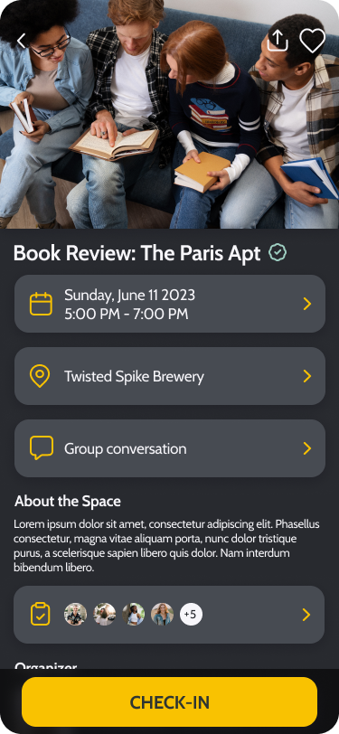
Checking In


Messaging


More


Reflection
The hardest part of this design was keeping in mind that this is not a typical conversion problem. If I had more time, I would continue usability testing to reaffirm that gamification and messaging is the best solution. I believe the small details I put into this app improves the overall experience.
