Defining the Problem
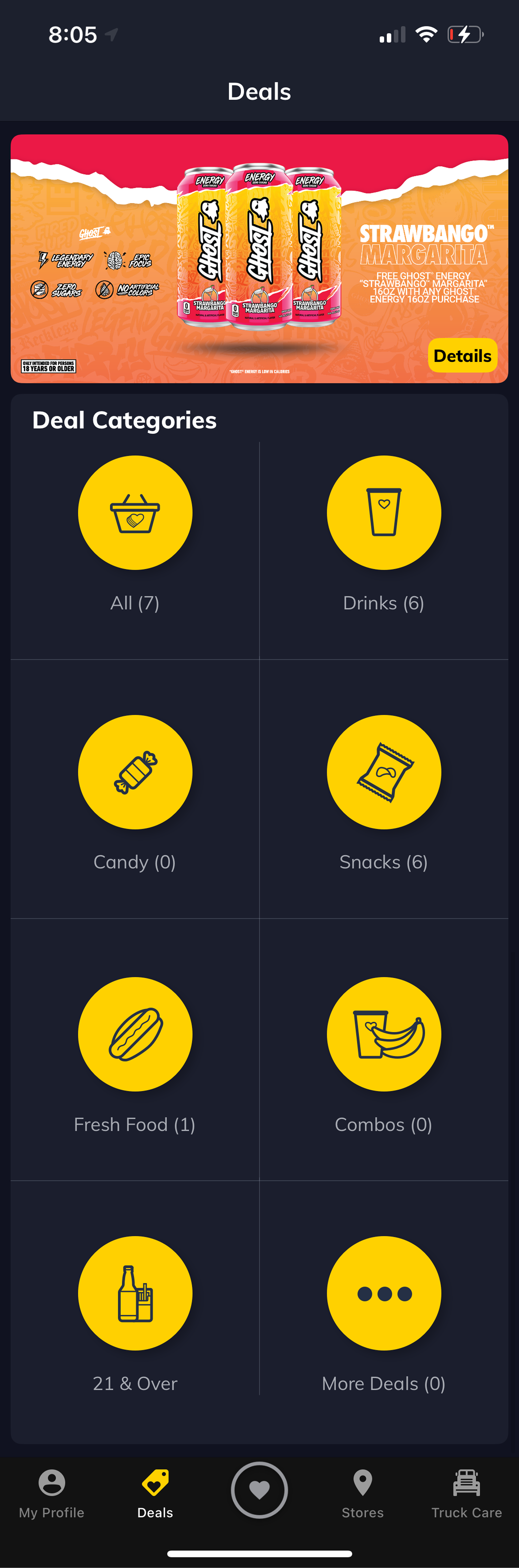
The original Deals page opened to a grid of category icons: Snacks, Drinks, Candy, Fresh Food, and more. To see any actual deal, users had to pick a category first and tap into it. The deals themselves were never visible from the landing screen.
This created a fundamental discovery problem. A user who wasn't already motivated to browse deals had no visual hook. No product image, no offer headline, nothing to stop the scroll. The page looked empty even when it wasn't.
The hypothesis going into research: the category-first structure wasn't helping users find what they wanted. It was just adding friction between them and the deals.

Research
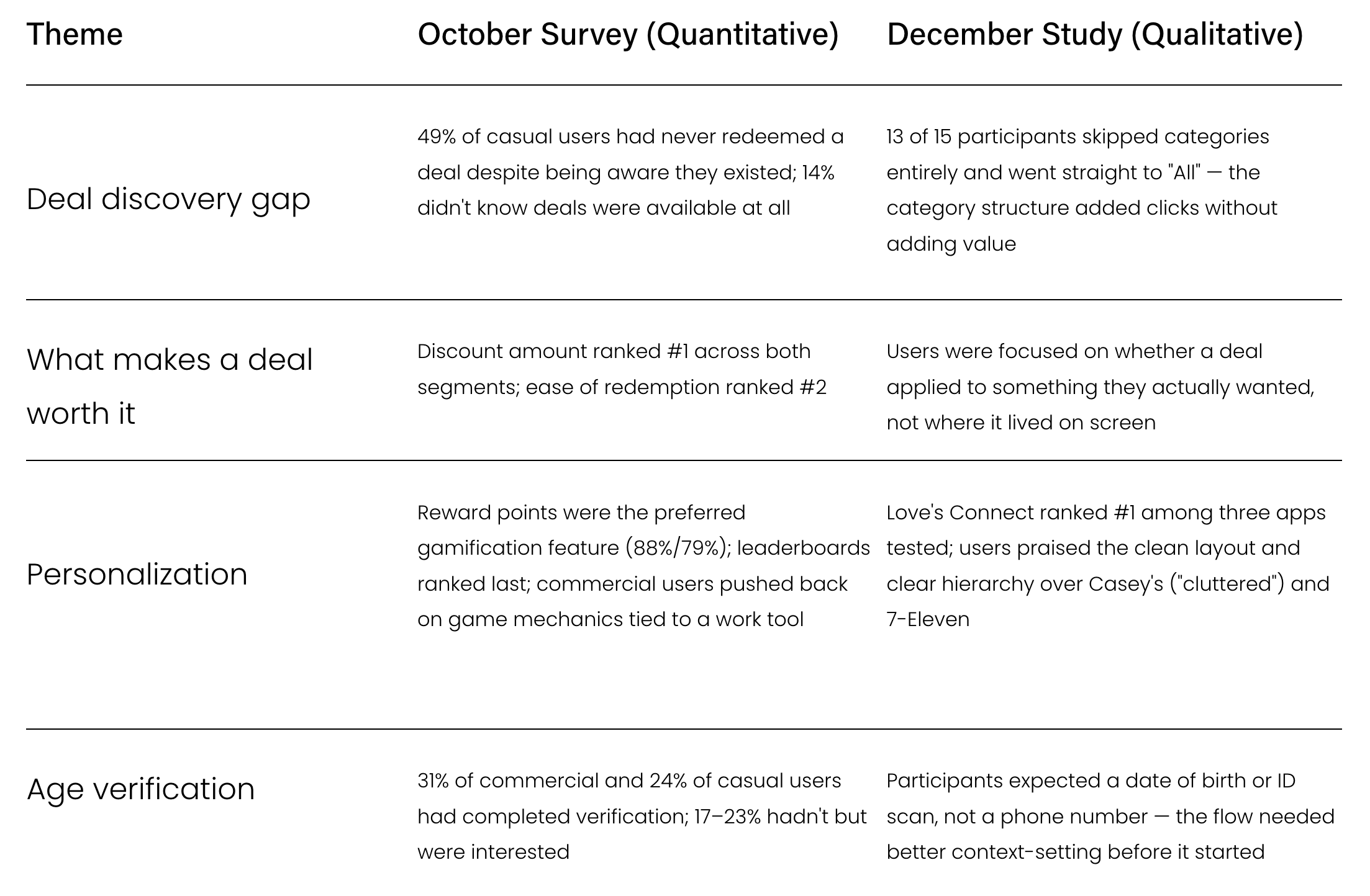
This project was informed by two complementary research efforts: a large-scale in-app survey (October 2024, n=8,742) and a moderated remote user study (December 2024, n=15), split across casual and commercial drivers.
The Throughline
The survey told us where the gaps were at scale. The study showed us exactly where the experience broke down in practice. Together they pointed to the same problem: deals were hard to find, and when users did find them, they weren't sure they were relevant. The redesign addresses visibility first. Personalization is the logical next step.
What We Found
The research confirmed the hypothesis but also sharpened it. The problem wasn't that users couldn't navigate the category structure. They could, and they did. Most participants completed the deal redemption flow without much trouble. The real problem was that the category-first layout made the page feel empty at a glance, which meant users with low intent — a group the survey put at over a third of casual users — never got to the deals at all.
The survey and study together also surfaced a second-order insight: personalization was the next frontier. The survey showed 58%/57% of commercial and casual users wanted purchase-history-based recommendations, and the study confirmed users were looking for deals that felt chosen for them. Solving visibility would help users find deals. But relevance would make those deals feel worth saving. That informed a key design recommendation going forward, even if personalization was out of scope for this version.
For the age verification flow, the confusion was less about the design and more about unset expectations. Users didn't understand what the phone number step was for. The fix wasn't to redesign the verification itself. It was to add an onboarding moment and a progress indicator so users understood the process before they started — and to give the 21+ segment, a real and underserved group per the survey, a cleaner path to the deals they were interested in.
In-app Deals Usage
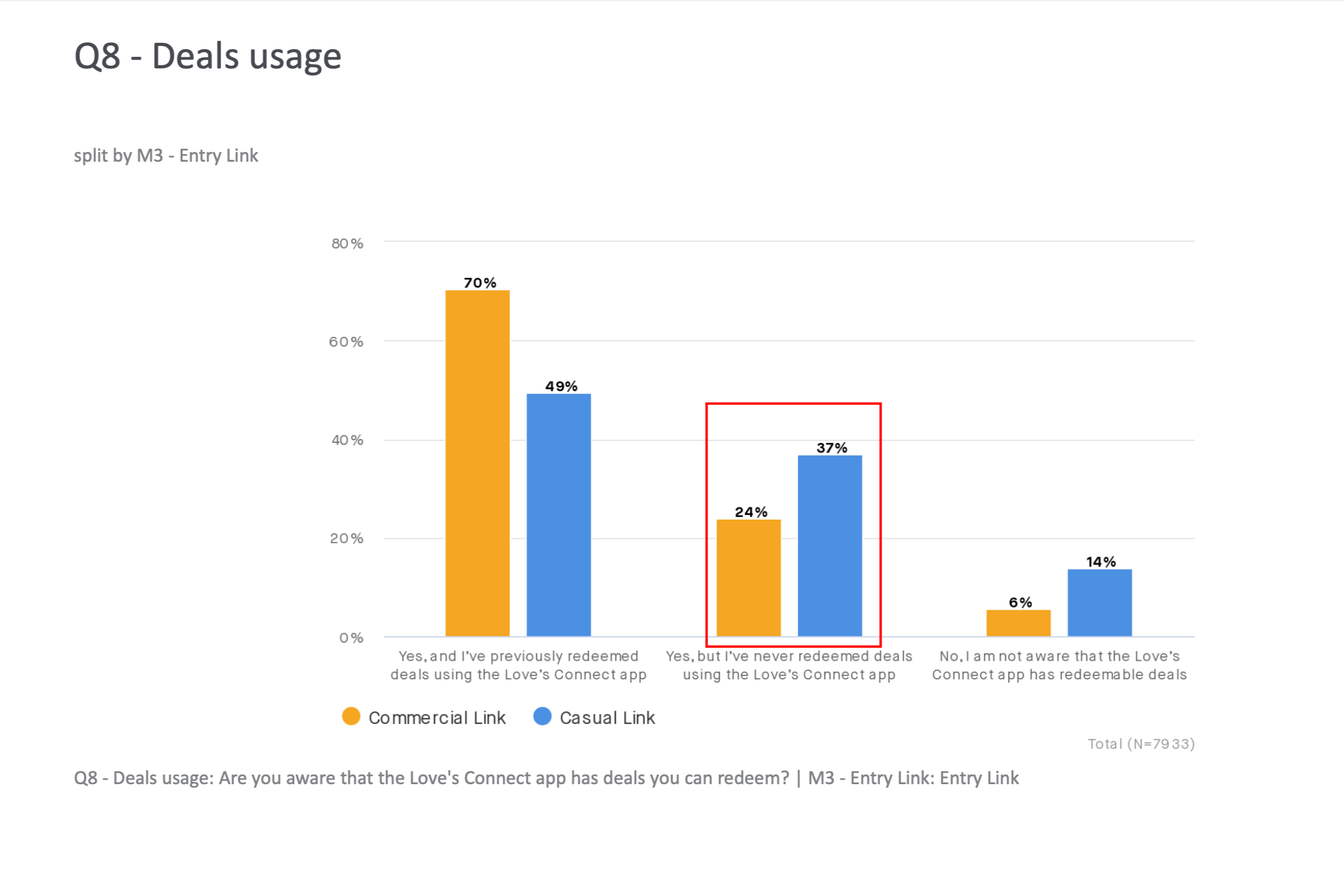
Over 1/3 of casuals are aware of deals on the Love’s Connect app, but report never having redeemed deals in the app
Only 49% of casuals have redeemed deals in the app, compared to 70% of commercials
14% of casuals are not aware that there are deals within the Love’s
-
When asked to add a deal, 13 out of 15 participants went straight to "All" and ignored the category structure entirely. Only 2 participants said they liked having deals split into categories. One participant described the categories as "a lot of additional clicks" that would block them from selecting a deal. This echoed the survey's finding that ease of redemption was the second-most important deal factor after discount amount — friction anywhere in the flow was friction that cost engagement.
-
The dominant insight wasn't about navigation at all. It was about relevance. Users were more focused on whether a deal applied to something they actually wanted than on where it was placed on screen. 8 out of 15 participants said they'd prefer deals recommended based on their purchase history — consistent with the 58% of commercial and 57% of casual survey respondents who said they'd want recommendations based on past purchase behavior. The sentiment that kept coming up: "I want deals for me."
-
Love's Connect ranked #1 among the three apps tested, with 9 out of 15 participants preferring it. They cited the clean layout, dark mode, and clear hierarchy as standout qualities compared to Casey's (which participants called "cluttered" and "too much on one screen") and 7-Eleven. The existing foundation was strong. The Deals page just needed to catch up with it.
-
For the 21+ deal flow, there was confusion around why a phone number was being requested at the start of the verification process. Most participants expected to enter a date of birth or scan an ID, not a phone number. This was a clear signal that the flow needed better onboarding and context-setting. The survey added relevant context here: 31% of commercial and 24% of casual respondents had completed age verification, while 17% of commercials and 23% of casuals said they hadn't but would be interested — a meaningful untapped segment that a clearer flow could convert.
Design Decisions
Bringing deals out of hiding
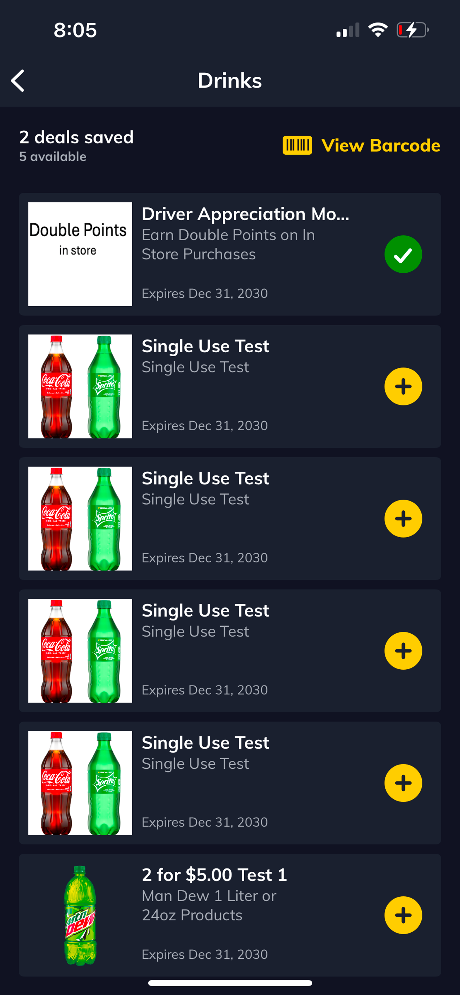
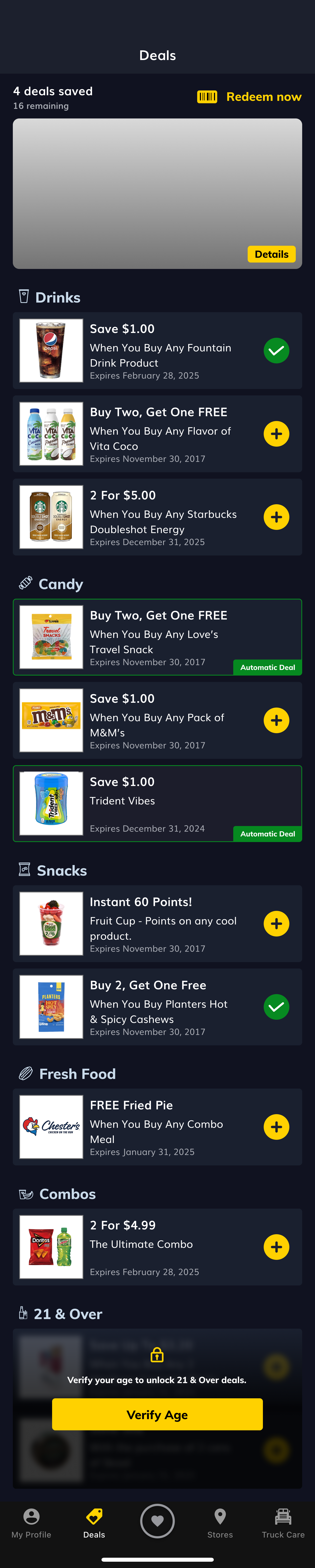
The core structural change was removing the category grid as the landing experience and surfacing deals directly. The redesigned page opens with deal cards that show a product image, offer headline, expiration date, and a clear save or redeem action, all visible without any additional taps.
Deals are still grouped by category, but as labeled sections within a scrollable list rather than as gates to enter. The category becomes context, not a barrier.
This directly addressed what the research showed: users go to "All" anyway. The new design just makes "All" the default.
Card design and deal hierarchy
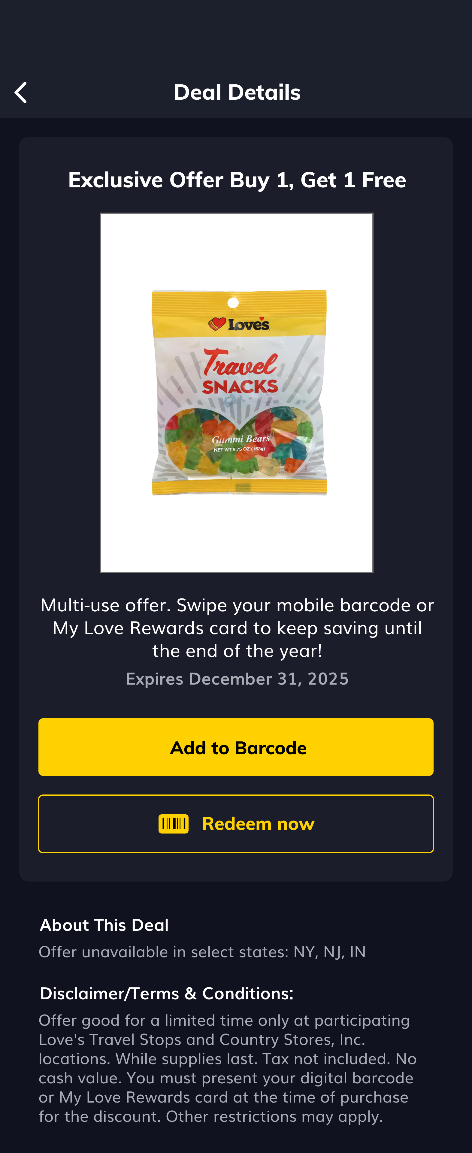
Each deal card was redesigned to communicate value at a glance. Product imagery anchors the card visually. The offer headline leads — something like "Buy 1, Get 1 Free" or "Save $2.00" — with supporting detail below. Automatic deals are visually distinguished with a badge so users know they don't need to take action.
The survey made clear that discount amount was the top priority for users across both segments. The card hierarchy reflects that directly: the offer is the first thing you read, not the brand or category.
The card layout also needed to flex for two non-standard deal types that were introduced alongside the redesign.
Externally-sourced deals.
A new category of partner-provided deals had a different format and sizing than native Love's deals. These needed to integrate into the redesigned layout without breaking the visual system or confusing users about what they were looking at. I designed a card treatment that fit the new grid while signaling the external source clearly.
Age-verified deals.
Restricted deals (21+) needed to be visible to all users, consistent with the research finding that hiding content removes the motivation to engage, while still being gated appropriately. The survey showed tobacco accounted for 91% of commercial and 87% of casual 21+ redemptions, making this a high-volume category worth getting right.
I designed a locked access state that shows the deal exists, explains the restriction, and walks the user through a one-time verification flow. Based on research feedback about confusion at the phone number step, the flow includes an onboarding moment that sets expectations before the user begins.

Before and After
Before:
Users landed on a grid of category icons. No deals were visible. To see any offer, users had to select a category and navigate into it. A minimum of two taps before seeing any content. The page communicated nothing about what was available.
After:
Users land directly on deal cards. Offers are visible immediately, with product image, headline, expiration date, and a save or redeem action. Categories appear as labeled sections within the scroll rather than entry gates. The page communicates value from the first frame.
Outcome
The redesigned Deals page shipped as part of the v.15 release and is live across Love's Connect's 6.1M+ user base. The card system, category structure, age verification flow, and externally-sourced deal type are all in active production.
In the six months following launch, total deal redemptions increased by 14.1%, rising from 2.57M to 2.93M. Total discount amount grew from $5.4M to $6.1M, a 13.4% increase.
Commercial users saw the sharpest lift, with redemptions up 26.7% and discount amount up 24.1%.
Both segments grew in absolute redemptions. Casual users added 50,000+ redemptions period over period, while Commercial users added over 310,000, a signal that the redesign particularly resonated with the higher frequency commercial segment that the research had identified as under-leveraged on deal engagement.
Next Step
Personalization is the clearest next step. Both the survey and the study pointed to the same thing: users want deals that feel chosen for them. The visibility problem is solved. The next version of this work is relevance, surfacing the right deal to the right user based on their purchase history, vehicle type, and behavior. The backend groundwork to support that is already on the roadmap